Chapter 7: Contour Tool
Summary

Figure 7-1 The Make Contours tool delineates areas within a defined interval value in a climate-variable.
The Make Contours tool (red box in Figure 7‑1) delineates areas within a defined interval value in a climate variable. Analyzing contours from different periods of time helps to identify changes in a variable within a region. For example: we could identify the changes in rainfall-receiving areas with more than 350 mm during the Belg season (Feb-May) in Ethiopia in the last 40 years, by comparing the contours for average rainfall in the period 1981-2001 and 2002-2020.
7.1. Making contours
To run the tool, follow the steps below:
Open the Make Contours tool from the GeoCLIM main toolbar.
Specify the BIL input file; in this example, we are using the average February-May rainfall season for the period 1981-2001; see Figure 7‑2(1).
The tool automatically specifies the output file; see Figure 7‑2 (2).
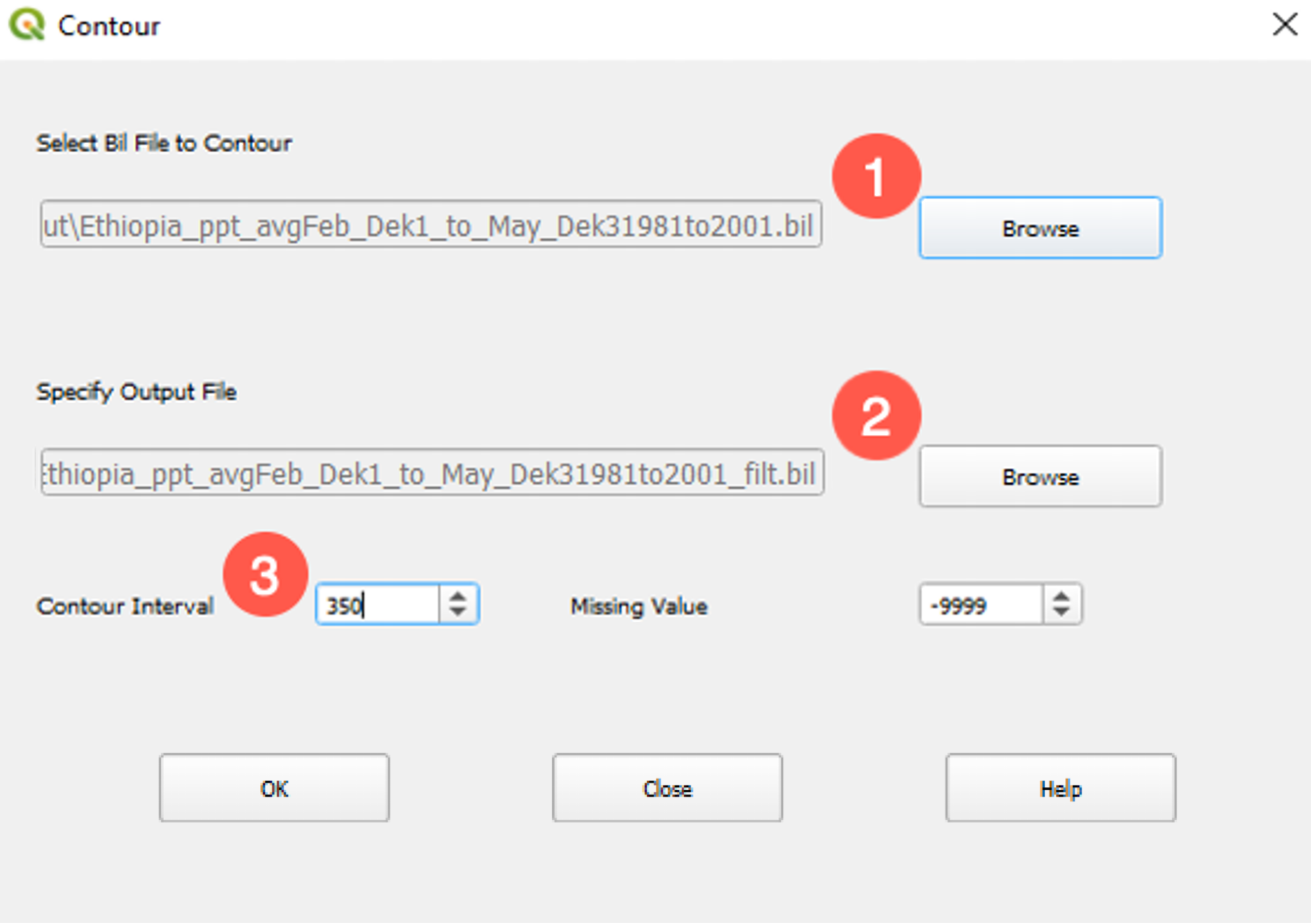
Figure 7-2 GeoCLIM facilitates the delineation of areas within a range of rainfall values.
Select a contour interval value. In this case, 350 for an interval of rainfall of 350 mm (Figure 7‑2 (3).)
Change the missing value if necessary.
Click OK to run the tool.
After calculating the contours for both periods of time, the results show an increase/decrease in rainfall in polygons 1/2, respectively in Figure 7‑3.
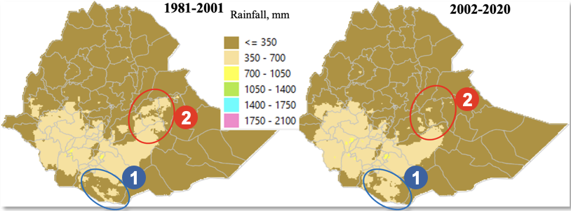
Figure 7-3 The 350 mm interval of average rainfall for the Feb-May season, during the periods 1981-2001 (map on the left), 2002-2020 (map on the right), show reduction of rainfall in areas in red.
To further identify the difference between the two periods, we can overlay the areas with more than 350 mm, as shown in Figure 7‑4 (a). The image shows that the area that receives more than 350mm is shrinking in the eastern part of the country. We then compare the results to a population map and see that rainfall is decreasing in highly populated areas, Figure 7‑4 (b).
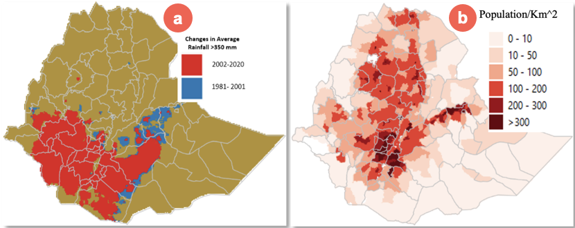
Figure 7-4 Changes in rainfall patterns during the Belg season in Ethiopia. Image A shows the changes in areas that receive > 350mm. Image B shows the population per Km^2.
The map in Figure 7‑4(a) was produced as follows:
Use GeoCLIM to calculate average 1981-2001 and 2002 -2020.
Use the Contours tool at a given interval (350mm for this example.)
Use the raster calculator in QGIS to create a binary layer; values greater than 350 = 1 and values less than 350 = 0. (layer < 350) * 0 + (layer >= 350) * 1.
Use the Raster/conversion/polygonize tool in QGIS to create polygons from the binary layers.
Overlay the two resulting polygon shapefiles.