Calculations in SMPG
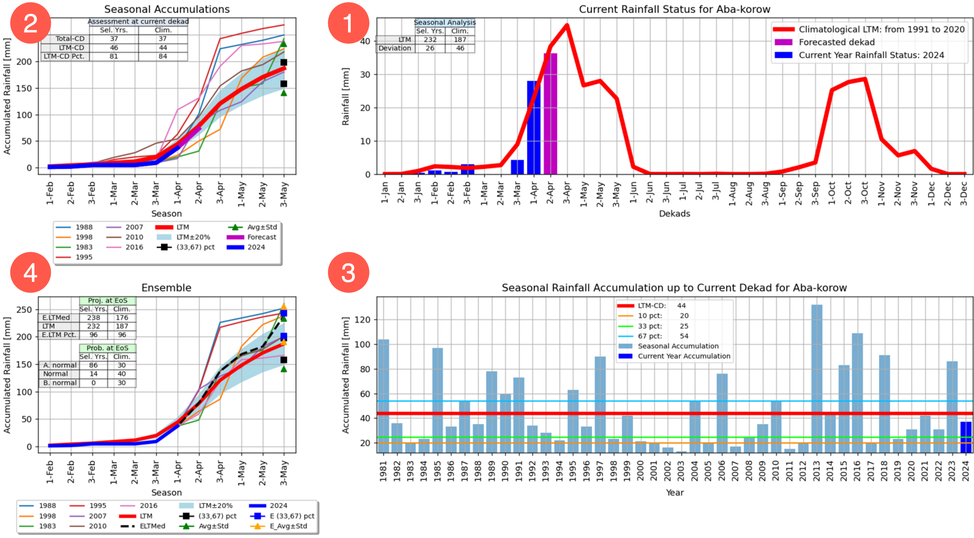
The SMPG produces a report for each polygon. The report is made of four plots. Each plot contains a table with statistics results and a graph describing the current season. The plots are as follows:
Upper-right plot is the Seasonal analysis plot.
Upper-left is the assessment at the current dekad plot.
Lower-right is the seasonal rainfall accumulation up to current dekad.
Lower-left plot is the Ensemble.
Each plot contains a table with statistics results and a graph describing the current season. Each table contains:
A title describing the type of results
Two columns with the following headings:
Sel. Yrs: This column displays the calculations done using the selected years (for example, analog years or all years) when running the tool.
Clim.: This column displays the calculations done using the climatological period selected when setting the tool.

1. Seasonal Analysis plot
The table for the Seasonal Analysis plot contains two rows:
LTM: Indicates describes the average seasonal total for the selected period, for example, February 1st to May 3rd, top reports.
Deviation: Standard deviation for the complete season using the climatological period selected.
2. Assessment at current dekad plot
The table for the Assessment at current dekad (CD) plot contains the following rows:
Total-CD: The accumulation from the start of season (defined in the tool) to current dekad. This calculation uses only the current-season values.
LTM-CD: The accumulation of the long-term average from the SOS to the current dekad. In the image above, this is the accumulation of the red line from the 1st of February to the 1st dekad of April.
LTM-CDpct: Percent of average at current dekad, as expressed by the equation LTM-CD pct=(Total) /(LTM)
3. Seasonal Rainfall Accumulation up to Current Dekad plot
The Seasonal Rainfall Accumulation up to Current Dekad plot shows the accumulation of the season up to the current dekad for each year in the time series.
This plot includes the following lines:
LTM-CD (red line): The average accumulation, using the climatological period defined
10 pct (yellow line): 10th percentile using the climatological period defined
33 pct (green line): 33rd percentile using the climatological period defined
67 pct (blue line): 67th percentile using the climatological period defined
4. Ensemble plot
The SMPG tool uses historical data from selected analog years to simulate the remainder of the current season, generating a range of possible scenarios. Based on these simulations, the SMPG calculates the probability of the season ending above-normal, normal, or below-normal. By determining the median of all scenarios, the tool identifies the most likely outcome for the season's end. The percentile rank of this most likely scenario indicates whether the season is expected to end above-normal (>66th percentile), normal (33rd-66th percentile), or below-normal (<33rd percentile).
This Ensemble plot illustrates the range of possible scenarios derived by using data from each of the selected years to complete the current season. The dotted line represents the median scenario or the most likely outcome.
Two tables are included with the Ensemble plot:
Proj. at EoS (upper table)
This table describes the outlook at the end of the season. The table includes the following rows:
E.LTMed: the median of all the scenarios at the end of the season
LTM: the average at the end of the season calculated using the climatological period selected
E.LTM Pct.:the percent of the most likely scenario (dotted line) with respect to the long-term average (red line) at the end of the season.
Prob. at EOS (lower table)
This table shows the probability of the season ending below normal (>33rd percentile), normal (between the 33rd and 67th percentiles) or above (<67th percentile) normal. The calculation is done by counting the number of scenarios in each range and dividing it by the total number of scenarios.
