Chapter 4: Climatological Analysis
Summary

Figure 4-1 The Climatological Analysis tool facilitates the calculation of statistics among other functions for climate variables.
The Climatological Analysis tool (red box in Figure 4-1) facilitates the calculation of statistics, trends, and frequencies (among others) for rainfall, temperature, and evapotranspiration. The tool uses data that have already been downloaded or imported into the fews_tools data directory (see chapter 2 for how to manage data in fews_tools). You can analyze a climate time-series or just a selected subset, such as the March-April-May season for a given number of years such as El Niño years; for example, you may select 1982-83, 1986-87, 1987-88, 1991-92, 1997-1998, 2002-03, 2009-10, 2015-16.
The Climatological Analysis tool includes the following analysis methods:
Average: Calculates the temporal average value for each pixel for a period or group of periods using the years selected.
Median: Calculates the midpoint value of a frequency distribution for the selected climate variable for a group of periods using the selected years.
Standard deviation: Calculates the standard deviation in a frequency distribution for the selected climate variable for a group of periods using the selected years.
Count: Counts the number of valid values by pixel in a time-series.
Coefficient of variation: Calculates the Coefficient of Variation (CV), which is the ratio of the SD to the mean in percent.
Trend: Calculates a linear trend using a regression analysis of the seasonal values and time.
Percentiles: Produces a raster map with the rainfall value for each pixel corresponding to the percentile rank requested.
Frequency: Calculates the number of times a range of values has occurred in the time-series.
Standardized Precipitation Index (SPI): Presents a rainfall anomaly as a normalized variable.
4.1. Running climatological analysis
To open the climatological analysis tool, click on the rainfall Climatological Analysis :Rainfall: icon on the GeoCLIM toolbar (Figure 4‑1). To use the tool, follow the steps below:
Select the dataset from the Dataset ˅ pulldown menu, (Figure 4‑2 (1)). This will make available the regions that are within the geographic domain of the dataset. If your region is not available, make sure that the lat/lon box of your region is inside the domain of the dataset.
Select the region of interest (Figure 4‑2 (2)), (see chapter 2 to set up a region).
NOTE: The number of regions available depend on the geographic extent of the dataset. If your region does not show up after selecting the dataset, make sure that your region is inside the geographic domain of the dataset.
The Parameter field is filled automatically with the name of the climate variable (Rainfall, Avg Temperature, Min Temperature, Max Temperature, or Evapotranspiration) depending on the dataset selected, see (Figure 4‑2 (3)).
Select the type of analysis from the Analysis ˅ menu (Figure 4‑2 (4)).
Check the ■ Add up seasonal totals box as shown in (Figure 4‑2 (5)), to indicate that the analysis will be done using the seasonal totals.
If the season to analyze goes across years, for example, Oct to March, check the ■ July to June Sequence checkbox (Figure 4‑2 (6)).
Select the periods comprising a season of interest on the left panel. The data period (pentads, dekads, or months) is based on the selected climate dataset. In this case, the data period is 10 days totals (dekads) (Figure 4‑2 (7)).
Select the years of interest on the right panel (Figure 4‑2 (8)).
(Optional) Modify the Output Folder field if you want to save outputs in a different location than the default path.
Modify the Output Prefix if necessary.
NOTE: Make sure the last year selected contains a complete season; otherwise, there will be a “missing data” error message that would prevent the tool from running.
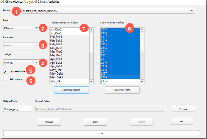
Figure 4-2 The Climatological Analysis tool facilitates the calculation of statistics, trends, SPI among other analysis, using the complete or part of the time series for a season.
The output from this analysis is displayed on the QGIS canvas (Figure 4-3). This result is also saved in the output folder together with the seasonal totals for each year, as raster data sets in the same format as the input data.
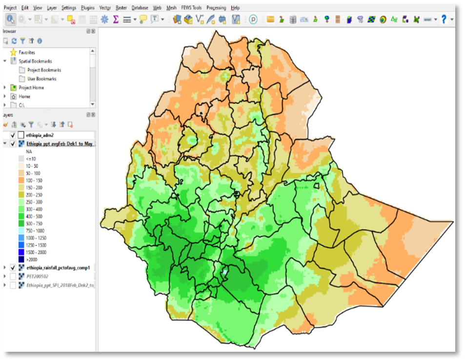
Figure 4-3 Average rainfall for the period Feb dek01 - May dek03 1981-2010.
NOTE: If multiple periods are selected (e.g., March-April-May) and the ■ Add up seasonal totals box is NOT checked, the process runs for each month, and the results are displayed on the QGIS canvas.
4.2. Updating dataset averages
Fews_tools uses the average for each period (pentad, dekad, or month) for calculating anomalies. The Climatological Analysis tool calculates the average for every period based on the information saved during the dataset definition, (see FEWS Tools Settings, chapter 2). To calculate the average, follow the steps below:
Select the Dataset, Figure 4-4(1)
Select all the periods, Figure 4-4(2)
Select the years to be used in calculating the average, Figure 4-4(3). Make sure that all the years selected have data for all the periods.
Check the ■ Update dataset averages box, Figure 4-4(4).
Click on Analyze. The raster-file outputs are saved in the folder and with the prefix defined on the climate dataset definition.
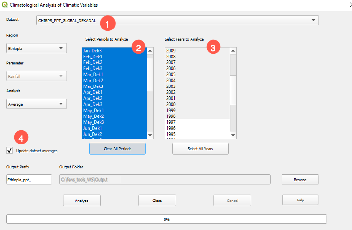
Figure 4-4 The Climatological Analysis tool allows us to calculate the average for each period (month, dekad or pentad) for the dataset.
NOTE: The ■ Update Dataset Averages option creates the average for the geographic extend of the dataset.
4.3. Analysis methods
4.3.1. Average
The Average analysis method calculates the temporal average value for each pixel for a period, for example, the month of May, dekad 3, or a season (May-June-July) using the years and region selected. Figure 4‑5 shows the average rainfall using CHIRPS data for the period May to July 1981-2013, for the selected region (EAC). In other words, the map represents the average of all May-June-July rainfall totals from 1981 to 2013.
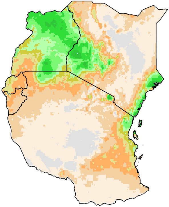
Figure 4-5 Average rainfall (mm) for the May-July season for the years 1981-2013.
To calculate the average, follow the steps below:
Start the Climatological Analysis tool, as described in section 4.1.
Select the dataset.
Select the region.
Select Average from the analysis methods list.
Check the ■ Seasonal totals option.
Select May Dek1 to July dek3 on the left panel and 1981-2013 on the right.
Click on Analyze to run the tool.
NOTE: When the ■ Seasonal totals option is not checked, the average is calculated for each period selected (pentad, dekad, or month). In the example above, the module would calculate the average for May dekad 1; 1981-2013, May dekad 2; 1981-2013, etc., until July Dekad 3.
NOTE: A by-product of this process is a seasonal total file in raster format saved for each year in the output directory.
4.3.2. Median
The Median analysis method calculates the midpoint value of a frequency distribution for the selected climate variable. Figure 4‑6 shows an example of median output calculated for May-to-July rainfall totals for the years 1981-2013.
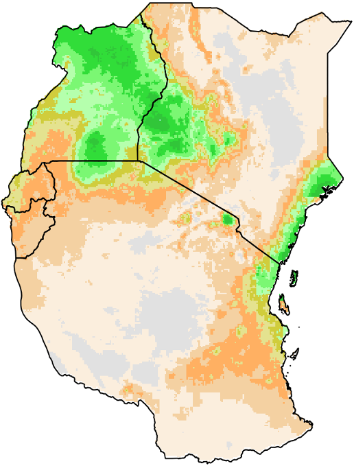
Figure 4-6 Median (mm) for the season May-July for the years 1981-2013.
To calculate the median, follow the steps below:
Start the Climatological Analysis tool, as described in section 4.1.
Select the dataset.
Select the region.
Select the season on the left panel and the years on the right panel.
Check the ■ Seasonal totals option.
Select Median from the analysis methods list.
Click on Analyze to run the analysis.
4.3.3. Measuring variability with standard deviation and coefficient of variation
FEWS Tools provides two different methods of estimating variability. The standard deviation (SD) shows the variability within the time series over the selected years for each pixel, while the coefficient of variation (CV) shows the SD as a percent of average, facilitating the comparison of the variability among regions.
4.3.3.1. Standard deviation
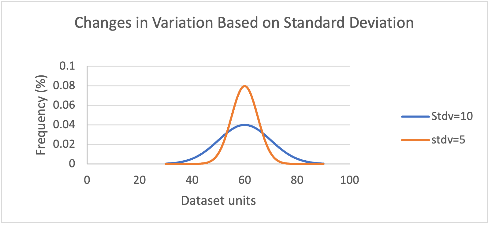
Figure 4-7 The distribution of two data sets with the same mean and different SD. The orange line shows a low SD (stdv=5) indicating low variability within the data; values are closer to the mean. The blue line shows the distribution of a more variable data set (stdv=10).
The standard deviation (SD) is a measure of variation or how spread out the data are from the mean. An increase in the SD indicates that the data is more variable (Figure 4‑7). See Figure 4-8(a) for an example of an SD product using fews_tools.
4.3.3.2. Coefficient of Variation
The Coefficient of Variation (CV) is the ratio of the SD to the mean CV = (SD/average) * 100.
SD | Mean | CV |
|---|---|---|
171mm | 721mm | 24% |
Table 4.1 The CV is the ratio of the SD over the mean.
Figure 4‑8 (a.1) and (a.2) show an example of low and high SD, respectively. But this information alone does not allow us to determine which area is more variable. The CV allows us to compare different magnitudes of variation or between regions with different means. Figure 4‑8 (b) shows that even though regions 1 and 2 have low/high SD when compared to the average amount of rainfall, area 1 is more variable.
To calculate standard deviation or coefficient of variation, follow the steps below:
Start the Climatological Analysis tool, as described in section 4.1.
Select the dataset.
Select the region.
Select the season on the left panel and the years on the right panel.
Check the ■ Seasonal totals option.
Select Standard Deviation or Coefficient of Variation from the analysis methods list.
Click on Analyze to run the analysis.
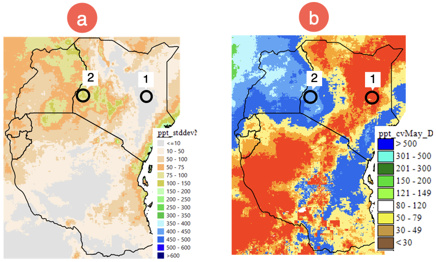
Figure 4-8 (a) shows the SD of rainfall (mm), (b) presents the CV (SD as a percent of the mean) allowing the comparison among areas. The SD of areas 1 and 2 shown as low/high value but 1 is highly variable compared to area 2, as shown by the CV.
4.3.4. Count
The count analysis method on the Climatological Rainfall Analysis tool shows the number of pixels in the selected years, with valid values (any values which are not missing value). The example in Figure 4‑9 shows the count as 40 (1981-2020) for all pixels, which means there are no missing values in the time-series used in the analysis.
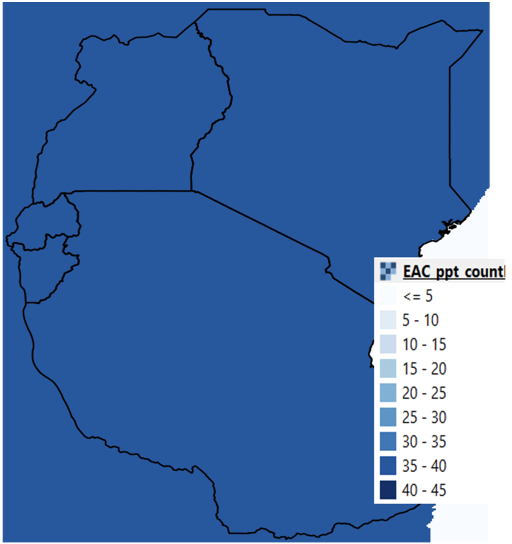
Figure 4-9 The function counts the number of valid values in the time series. In the example, there is no missing data and there are 40 values.
To calculate count, follow the steps below:
Start the Climatological Analysis tool, as described in section 4.1.
Select the dataset.
Select the region.
Select the season on the left panel and the years on the right panel.
Check the ■ Seasonal totals option.
Select Count from the analysis methods list.
Click on Analyze to run the analysis.
4.3.5. Trend
The trend is an analysis technique that helps us identify a change in the expected value of a variable that occurs over a long period of time. The trend analysis method in GeoCLIM first calculates the total seasonal rainfall for each selected year and then calculates a linear trend using a regression analysis of the seasonal values and time (Figure 4‑10). This function in GeoCLIM produces two maps; one is the slope of the regression which represents the trend, and the other is the coefficient of determination (r-squared, or r2), which represents the strength of the relationship.
To calculate the trend, follow the steps below:
Start the Climatological Analysis tool, as described in section 4.1.
Select the dataset.
Select the region.
Select the season on the left panel and the years on the right panel.
Check the ■ Seasonal totals option.
Select Trend from the analysis methods list.
Click on Analyze to run the analysis.
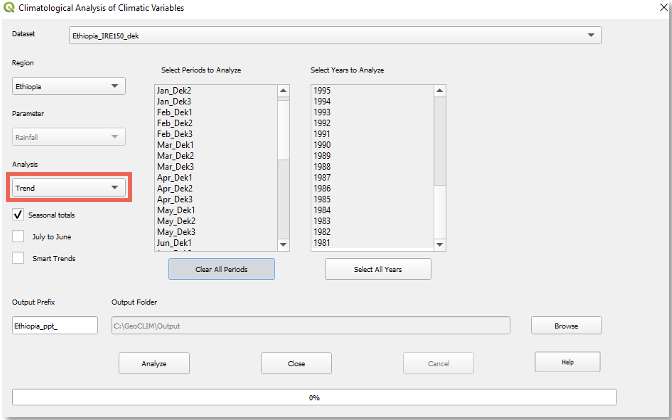
Figure 4-10 To calculate the trend for a climate variable, select the season, make sure that the Seasonal totals option is checked, and select the years to be used in the calculation.
Figure 4‑11 shows the results of the Trend analysis method in GeoCLIM for the annual rainfall total in Ethiopia for the period 1981 – 2016, using the Improved Rainfall Estimates (IRE) data, see chapter 10 on how to create IRE data. Figure 4‑11(1) shows the slope of the regression line, or the trend for each pixel in mm/decade of increasing (green-blue) or decreasing (pink-red) rainfall. The legend shows these results per decade (10 years). Figure 4‑11 (2) shows the coefficient of determination (r-squared, or r2) (multiplied by 100) of the linear regression between the variable and time as an indication of the reliability of the trend. It is important to use both maps to develop a conclusion about trends in an area. For example, points a, b, and c show three sites with strong trends and different r2.
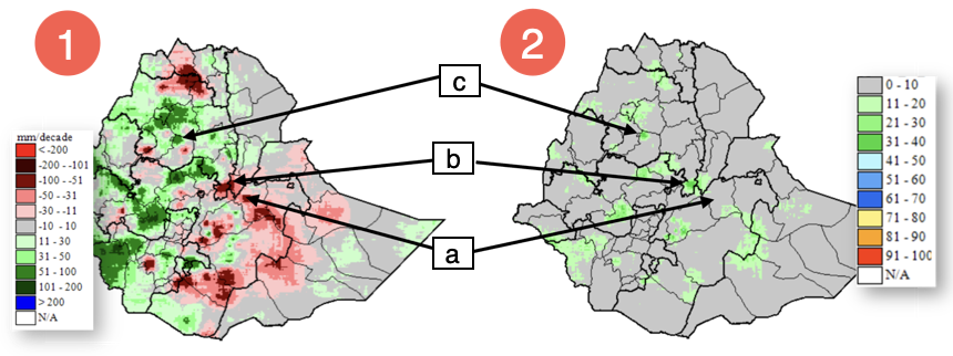
Figure 4-11 The trend analysis method in GeoCLIM produces two outputs. (1) Shows the slope of the regression in mm per decade decrease (pink-red) or increase (+ green-blue) and (2) shows the r2 of the regression.
Based on Figure 4‑11 (1) and (2), site (a) has a 71mm decrease per decade (dark red) with r2= 9% (grey), site (b) shows a 75mm decrease per decade (dark red) with r2 = 36% (dark green), while site (c) shows 89mm increase per decade (dark green) with r2 = 35% (dark green). Sites (a) and (b) have similar trends, but the r2 values show that site (b) has the strongest correlation. Also, sites (b) and (c) have similar r2 shown as green color. Figure 4‑12 shows the regression plots of total annual rainfall against time for sites a, b, and c. The annual total for the period 1981–2016 was extracted using the Extract Statistics function in GeoCLIM, for each site, and plotted using Excel. The plots in Figure 4‑12 corroborate the difference in r2 by showing how close the points are to the regression line. Site (a) shows the points scattered, while sites (b) and (c) show the points closer to the regression line.
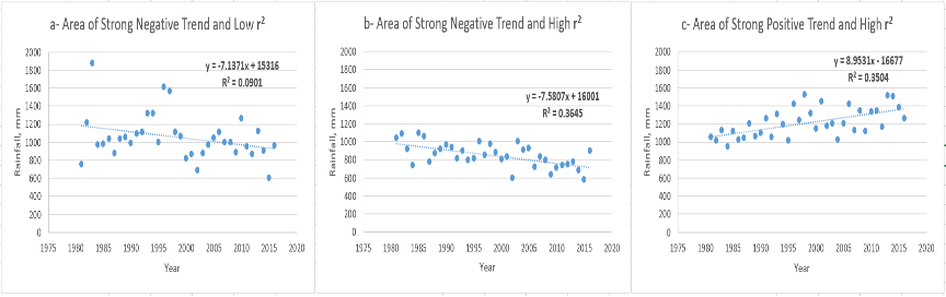
Figure 4-12 It is important to evaluate the strength of the relationship (r2) before making conclusions about the trend. Plots show three regions that present strong trends on Figure 4.10(1) (2) with different r2.
NOTE: It is important to use both maps to develop a conclusion about trends in an area, since the trend map shows how much change there has been in the time period we are analyzing, and the r2 map shows the reliability of the trend. The trend with a larger r2 value suggests a more robust trend, while the weaker r2 indicates that this trend may be by chance.
4.3.6. Percentiles
A percentile is a statistic that specifies the value below which a certain percent of observations in a ranked dataset will fall. Percentiles are calculated at breakpoints ranging from 0 to 100. The 0th percentile corresponds to the lowest value. The 100th percentile is the highest. The 50th percentile is the median value. To calculate a percentile value, we first must rank the time-series, and then identify the value associated with the nth percentile position.
For example, if the 20th percentile is 80 mm of rainfall, then we would expect that 20% of the time, rainfall would be less than or equal to 80 mm. One way of using percentiles is to answer questions like: “if we have the time series for the total FMAM season from 1981-2017 (table 4.2), what would we expect a 1-in-5-year dry event to look like?” To explore this question, we could calculate the 20th percentile. Statistically, we would expect rainfall of this amount or lower once every five years.
Another use of percentiles is when we have a value, let’s say the rainfall total for the FMAM for 2017=216 mm, and we would like to know what percentile that value represents, or how frequent a value like this happens. Using the data in table 4.2 (see Note below on how the data was obtained) and the PERCENTRANK function in Excel, we find that 216 mm is the 71st percentile or greater than 71% of the values in the dataset. The Percentiles function in GeoCLIM produces a raster map with the rainfall value for each pixel corresponding to the percentile rank requested.
To calculate a given percentile for your region of interest, follow the steps below:
Start the Climatological Analysis tool, as described in section 4.1.
Select the dataset.
Select the region.
Select the season on the left panel and the years on the right panel.
Check the ■ Seasonal totals option.
Select Percentile from the analysis methods list.
Enter the percentile rank desired; see Figure 4‑13 (1)).
Click on Analyze to run the analysis.
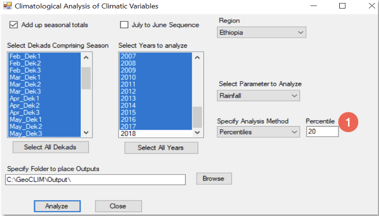
Figure 4-13 The Percentiles method in GeoCLIM produces a raster map with the rainfall value for each pixel corresponding to the percentile rank.
This function in GeoCLIM helps answer questions such as, what are the low/high values (e.g., 15th/90th percentiles) in the time-series? (Figure 4-14). Table 4.2 shows the time-series for the FMAM seasonal total for the period 1981-2017 for point (A) in Figure 4-14. The result of the PERCENTILE.EXC function in Excel shows that the 20th percentile is = 105.
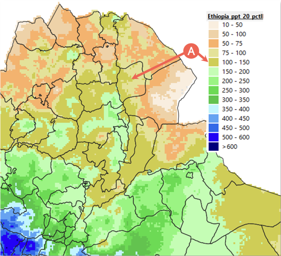
Figure 4-14 An example of rainfall accumulations (mm) corresponding to the 20th percentile rank for the FMAM season. This percentile rank defines a set of low frequency dry events. The default legend was modified to represent the data.
Feature | prec_FMAM | |
|---|---|---|
1 | 2009 | 35 |
2 | 2008 | 44 |
3 | 1984 | 61 |
4 | 1999 | 66 |
5 | 2011 | 79 |
6 | 2015 | 94 |
7 | 2000 | 103 |
8 | 1994 | 107 |
9 | 2013 | 120 |
10 | 1992 | 121 |
11 | 1998 | 2007 |
12 | 2007 | 123 |
13 | 1997 | 133 |
14 | 1982 | 134 |
15 | 1988 | 146 |
16 | 2001 | 153 |
17 | 1991 | 154 |
18 | 2003 | 162 |
19 | 2004 | 163 |
20 | 2012 | 163 |
21 | 1990 | 171 |
22 | 2014 | 175 |
23 | 2010 | 180 |
24 | 2005 | 181 |
25 | 2006 | 197 |
Table 4.2 Seasonal total FMAM 1981-2017 for point A in Figure 4-14, where 105 is the 20th percentile, 163 is the 50th percentile, and 215 is the 71st percentile.
NOTE: Table 4.2 was created using the Extract Statistics tool for a point shown in Figure 4‑14.
4.3.7. Frequency
The Frequency analysis method in the GeoCLIM Climatological Analysis module (Figure 4-15) allows you to determine how often a specific amount of precipitation has occurred over a given period in the time series. This tool generates two maps: one showing the number of times a range of values has occurred in the selected time series, and another displaying the frequency as a percentage based on the number of years selected. The Frequency method helps answer questions such as, “How many times has the total seasonal rainfall been less than 400 mm during the period from 1981 to 2020?” Answering these questions can help users decide whether an area is suitable for particular climate-dependent activities, such as farming certain crops or raising livestock. The legend in Figure 4-16 represents the number of events per decade (ten years).
To calculate the frequency of a range of values, follow the steps below:
Start the Climatological Analysis tool, as described in section 4.1.
Select the dataset.
Select the region.
Select the season on the left panel and the years on the right panel.
Check the ■ Seasonal totals option.
Select Frequency from the analysis methods list.
Fill in the values Between and And to define the range of values.
Click on Analyze to run the analysis.
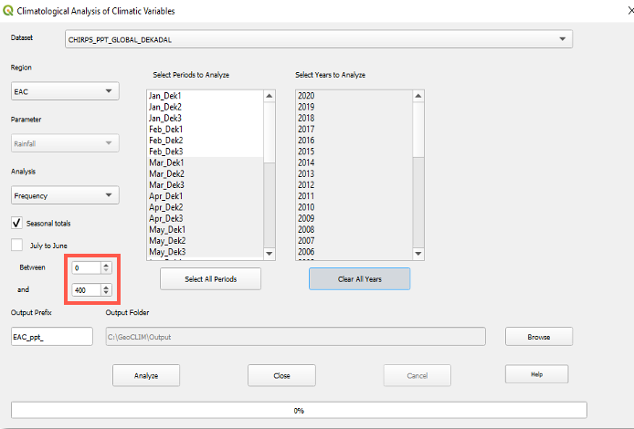
Figure 4-15 Frequency function allows for the selection of a range of values (red box) and identifies the number of times this range has occurred in the time series.
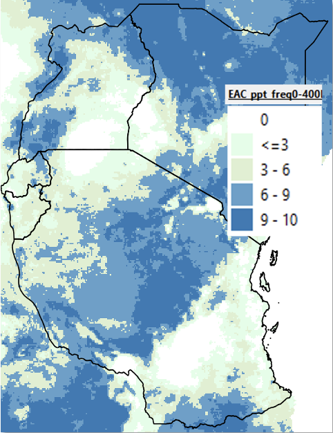
Figure 4-16 The tool calculates the number of times the selected range of values took place during the time series selected. The legend is in events per 10 years.
4.3.8. Standardized Precipitation Index (SPI)
SPI is a drought index that expresses the difference of precipitation from the mean, for a specified time period, in standard deviation units or z-scores. The SPI calculation uses historical data to determine the mean and standard deviation. Since precipitation is, in most cases, not normal for periods less than 12 months, the data must be transformed into a normal distribution. The new distribution of standardized precipitation is linearly proportional to precipitation deficit.
SPI values greater than zero indicate conditions wetter than the median, while negative SPI indicates drier-than-median conditions. For drought analysis, an SPI less than -1.0 indicates that the observation is roughly a one-in-six dry event and is termed "moderate." An SPI less than -1.5 indicates a one-in-fifteen dry event and is termed "extreme." Values less than -2.0 are typically referred to as "exceptional," indicating that it is in the driest 2% of all events. (Mckee 1993).
To calculate the SPI for a year or multiple years, follow the steps below:
Start the Climatological Analysis tool, as described in section 4.1.
Select the dataset.
Select the region.
Select the season; see Figure 4‑17 (1).
Check the ■ Seasonal totals option and select SPI from the analysis methods list; see Figure 4‑17 (2).
Select the group of year to make the time series; see Figure 4‑17 (3).
Select a single or a group of years for which SPI is to be calculated; see Figure 4‑17 (4).
Click on Analyze to run the analysis.
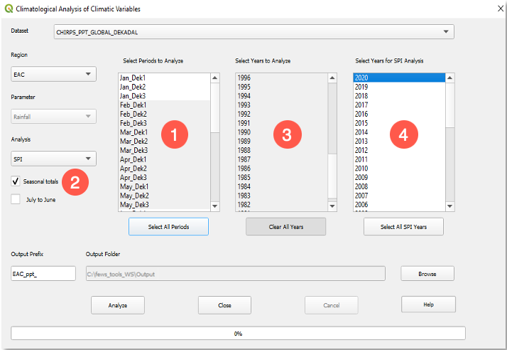
Figure 4-17 The GeoCLIM allows you to calculate the SPI for a single year or multiple years.
The resulting map shows, in tones of yellow to dark-brown, the areas that received below the median rainfall during the period of analysis. Colors light-blue to red indicate above median rainfall. See Figure 4-18.
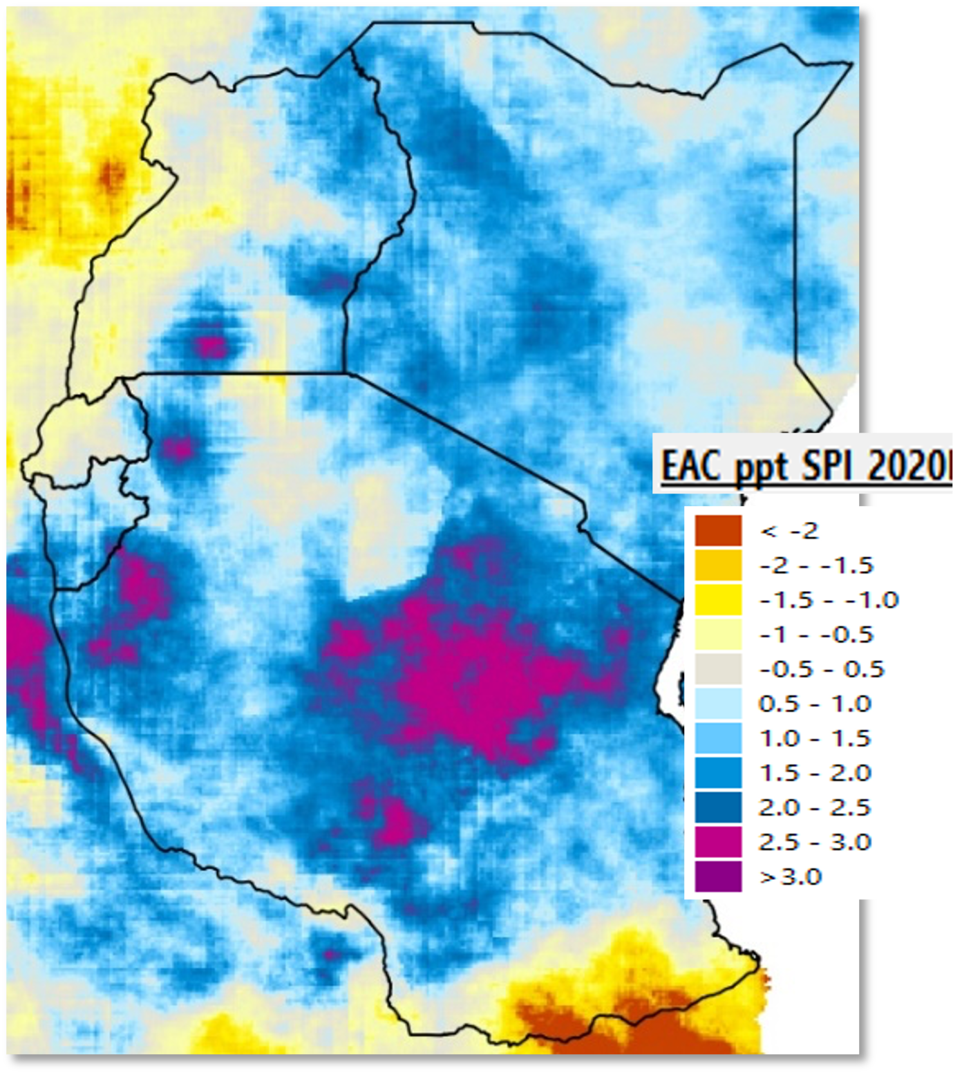
Figure 4-18 SPI Feb-May 2020 (CHIRPS 1981-2020). The GeoCLIM SPI raster output is in units of [SPI * 100], but the legend shows actual SPI values.